The Story Behind the CarbonBetter Brand System
Revealing the hidden meanings in the CarbonBetter brand system – a conversation with the artist.
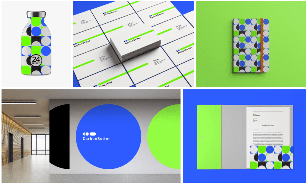
In the middle of the COVID-19 pandemic, we began the process of rebranding our company to better reflect our evolving mission and services. We hired Godfrey Dadich Partners (GDP) to help us explore our brand essence and messaging, and ultimately develop a new brand system that would carry the company into our next decade of existence. Soon after kicking off our engagement, we found ourselves immersed in a carefully crafted and guided creative process with the GDP team that ended with the beautiful designs featured on our website and brand materials today.
In this post we’re grateful for the opportunity to pull back the curtain on the design process with the help of Ensley Rivers, the Art Director involved in the creation of our new brand. Over the course of many weeks, we had several meetings with Ensley and the GDP team and we often found ourselves captivated as she shared the secret meanings behind the shapes and colors she chose.
As you’ll see in this post, seemingly insignificant individual design decisions come together to create a bold and robust brand system, similar to how we believe small changes in how all businesses operate will produce the environmental impact shifts that will save our planet.
The brand design process began with refining our brand strategy to help us build our brand framework and position messaging. The GDP team carefully listened to our comments, ideas, and concerns, and they helped us understand the visual side of the competitive landscape in which our brand would live.
From there, the GDP creative team started exploring visual territories that would bring our brand to life and help us stand apart from other companies in our space. Ultimately, we choose to evolve Ensley’s concept, though we understand that creating the entire brand system was very much a team effort. What follows is a conversation with Ensley about her background, her creative process, and how the CarbonBetter brand was born.
“For organizations that believe what’s good for our planet is good for business, CarbonBetter is your guide in decarbonization that helps you navigate the transition to a net-zero economy. “
The Strategic Foundation of the Carbonbetter Brand
Ensley Rivers, Art Director
Godfrey Dadich Partners
A Conversation with Ensley Rivers, Art Director
Ensley, what was your role in creating the CarbonBetter brand?
"As the Art Director, my role in creating the CarbonBetter brand was very hands-on. The creation of the brand from start to finish was a large team effort, and luckily I got to create, tweak, witness a lot of the design magic along the way.
Most notably, I played a large role in the creation of the new CarbonBetter logomark, including the creation of the Multiplier and defining its significance. Beyond the logomark, I was able to collaborate and shape the design of the extended brand elements such as color palettes, photography principles, and the new CarbonBetter website.
Being able to share this work with the CarbonBetter team over many weeks, and sensing the excitement made the process all the more enjoyable."
What's the story behind the “multiplier?”
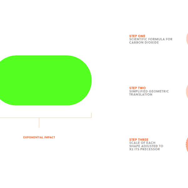
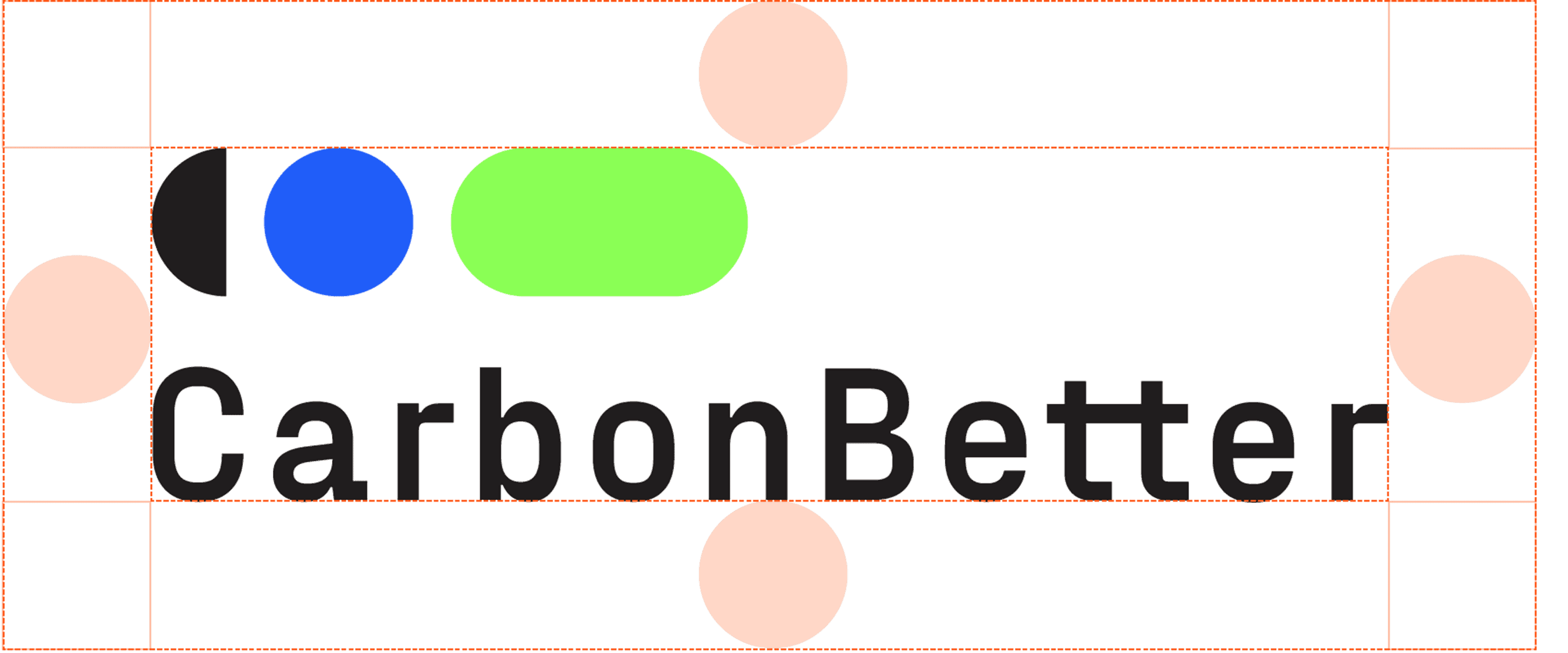
"The Multiplier is the graphical representation of the CarbonBetter mission, its form is inspired by the very element the company is fighting against—carbon dioxide.
From the scientific formula of carbon dioxide, we reduced “O=C=O” to a geometric representation of three circles. The size of the circles doubles in scale throughout the three-shape progression; the second circle is twice the size of the first shape, and the third shape is double that.
Its three-shape sequence starts with a half circle in, what we call, “Soft Black”, which represents CarbonBetter’s effort to reduce carbon emissions. Followed by a single “Better Blue” circle signifying the importance of a single person and action taken, and then a doublewide “Electric Green” pill shape that represents the exponential positive impact of each action."
ThE Colors are bold! How and why did you choose Them?
"We heard the passion the CarbonBetter team had for reshaping the conversation and practice around reducing carbon emissions, and the desire to empower and educate business owners to take their first steps in tackling climate change. The core palette we chose - Soft Black, Better Blue, and Electric Green - signifies that energy and optimism for a better future."
What's your approach or process when designing a new brand system?
"My approach to designing a brand system almost never looks the same from client to client. However, after I’ve had time to first digest a brief, I’ve recently started stepping away to go for walk or even listen to music. This is something I’ve started doing the past year and a half, made possible by working from home, and it helps relax my mind to get the ideas flowing.
Once myself and the rest of the creative team are ready to start ideating and executing, we work in lock-step with our strategy team at every stage. If I had to succinctly define my design approach it would be to ask a million questions! Every branding project at Godfrey Dadich starts with strategic client insights and discoveries, provided by our rockstar strategy team.
Designers and I rely on strategy to provide nuanced answers and clarity to the challenges our clients face, these answers will ultimately inform every step of our creative process. Once the brand system is developed we get to pull in our editorial and digital experience teams to continue to brainstorm and work off one another’s expertise. The whole process tends to be super collaborative and organic which makes the process all the more enjoyable, and honestly impressive when working from home miles apart."
Did creating a badge system with the brand system create any unique challenges?
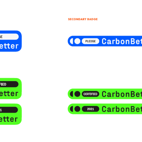
"Knowing that a badge system was going to be a key role in the CarbonBetter branding system, we started day one with this information in mind. Once we had our logo system—comprised of a primary, secondary, and special-use logomark—we knew we had a good foundation to make a flexible badging system.
Concerns we kept in mind while designing and iterating were: legibility at small sizes, ease of use across multiple application types (digital and print), brand recognition, and defining levels within the system. In the end, we were able to have a badging system that mirrored the logo system and used core brand colors to distinguish between “Certified” and “Pledge” members."
Meet Our Team
Our experience highlights that you can operate effectively in the status quo while preparing for a future net-zero economy.
Say HelloThe brand system has so many ways it can extend to different mediums - is that something you explore once you have Logomark and other elements created?
"The cool thing about creating brand systems is it can be a very non-linear process. The logomark tends to be the first piece of the “puzzle” we crack, but a rock-solid strategic brief formulated by our rockstar strategists and the client, enables us to jump around from piece to piece.
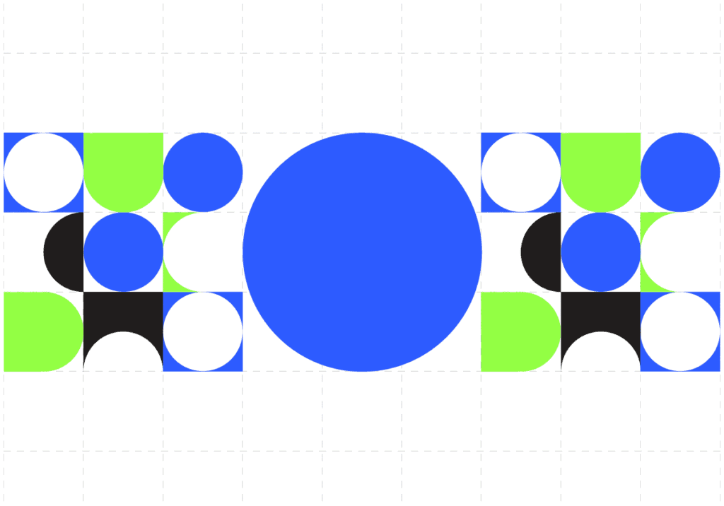
For example, defining the data visualization approach helped us refine our brand color palette. And cracking the dynamic brand pattern, later informed how nimble the graphic language based on the Multiplier truly could be. We continue on this organic pattern to work, continue to test for all scenarios until we develop a system that is beautiful, unique, and easy to implement."
Ensley, can you share a little bit about your background?
"I’m a born and raised Californian, where I grew up encouraged to explore many hobbies and interests. I spent half my time playing competitive travel soccer for 12 years, and the other half filling my parent’s house with various drawings, paintings, and pieces of ceramic.
Off the field, art was a favorite pastime and art classes were by far my favorite in school. When I graduated high school I pursued my BFA in Communication Design at Syracuse University. Since graduating and leaving New York, I lived in Ohio for a stint, before coming back to California where I now work at Godfrey Dadich Partners in San Francisco."
Have you always had a love for design, or was that something that developed later?
"For me, my love of design stems from being able to create something unexpected out of something seemingly ordinary. Growing up my grandma had a ceramic studio in her garage, kiln and all, and my favorite thing to do would be to glaze the odd pieces she would shape by hand.
Eventually, she started to let me make my own odd-ball creations, and I thought I would for sure grow up to be a ceramist and have my own studio one day, but when I entered high school I joined my school’s yearbook club I found new joy in creating in a new way. I helped create stories about my fellow oddballs armed with a 12-column grid and a growing knowledge of type hierarchies. While I have turned design into a career that I adore, I haven’t given up my love of clay and glazes."
If you weren’t an Art Director, what would you be?
"I’d be a ceramist! Have to follow in grandma’s footsteps."
Can you share a bit of what your day-to-day is like as an Art Director?
"As an Art Director my day-to-day looks quite different on any given day. Some days I’m sketching like a madwoman hopping between my sketchbook and computer drawing letterforms, symbols, and shapes - trying to crack creative puzzles; and some days I’ll be in high-energy “war-rooms” (though virtual these days) tossing ideas around with my teammates to solve the day’s set of creative problems.
I’m truly never bored and every day brings a new challenge that needs to be solved, I love it."
You and your team inspire us! Who inspires you in your work?
"When I get asked this I sometimes feel pressured to mention a classical artist from history or a renowned designer that has shaped the field of design, but truthfully these days I’m so invigorated by the up-and-coming artists of my generation. It’s so exciting to see so many artists in their 20’s or younger, so early in their craft, create unique work that intrinsically speaks to them and the story of who they are. And with social media I get to follow these talented people’s journey and it reminds me to never stop trying new things."
Has COVID-19 made artistic collaboration easier or more difficult?
"I feel like my answer to this question flip flops every day, so I’ll settle and just say it’s just different.
COVID-19 has revealed many silver linings in the collaboration process. I don’t think I speak only for myself when I say it's hard some days to create that spark of energy that comes from a lively in-person brainstorming or “jam-sesh” with your team, while in your fourth zoom call of the day from your couch.
But I’m really grateful to be a part of the Godfrey Dadich team where we have found new strengths in these times. Instead of collaboration being limited to the push-pin walls of a studio conference room, I’m connecting and sharing inspiration with teammates in Slack channels, inboxes, and even social media feeds. The process has just evolved."
How do you feel when you hand over a new brand to a client?
"Being able to hand over a finished brand system to a client that is just as excited, passionate, and proud of what has been accomplished is quite literally, with no exaggeration, my favorite part of what I do! And seeing a brand go from a kit of conceptual parts to a real business tool being utilized by a company is a real moment of awe."
Thank you for sharing with us, Ensley! It was such a special honor working with you to create the CarbonBetter brand system. If you're interested in getting in touch with Ensley, connect with her on LinkedIn, or reach out to Godfrey Dadich Partners.
